Etsy
Redesigning seller support to expand small business
OVERVIEW
Role: Lead UI Designer
Tools: Figma, Photoshop, Illustrator
Duration: 2 weeks
Team Members: Project Manager & Content Strategist
Devices: Mobile App
SUMMARY
Looked at Etsy’s existing seller app
Interviewed Etsy sellers and customers to discover pain points when both selling and buying from Etsy
Summarized research to identify patterns
Designed solutions to these problems in the form of a Prototype
Conducted Usability Testing and iterated on our Prototype
RESEARCH
Executive Summary
82% of Etsy sellers want to grow their business (Veeqo)
However, only 43% of sellers use the Etsy app to manage their sales
The App lacks the seller support needed to grow their businesses
The process of listing a product is too tedious
Therefore, the app needs revision
Competitive Analysis
Only Etsy and Amazon include internal ads
Even though Etsy is the least expensive platform, sellers still found it more difficult than the alternatives
The team was inspired to look into the Seller Support and SEO services that Amazon is currently implementing
Affinity Map
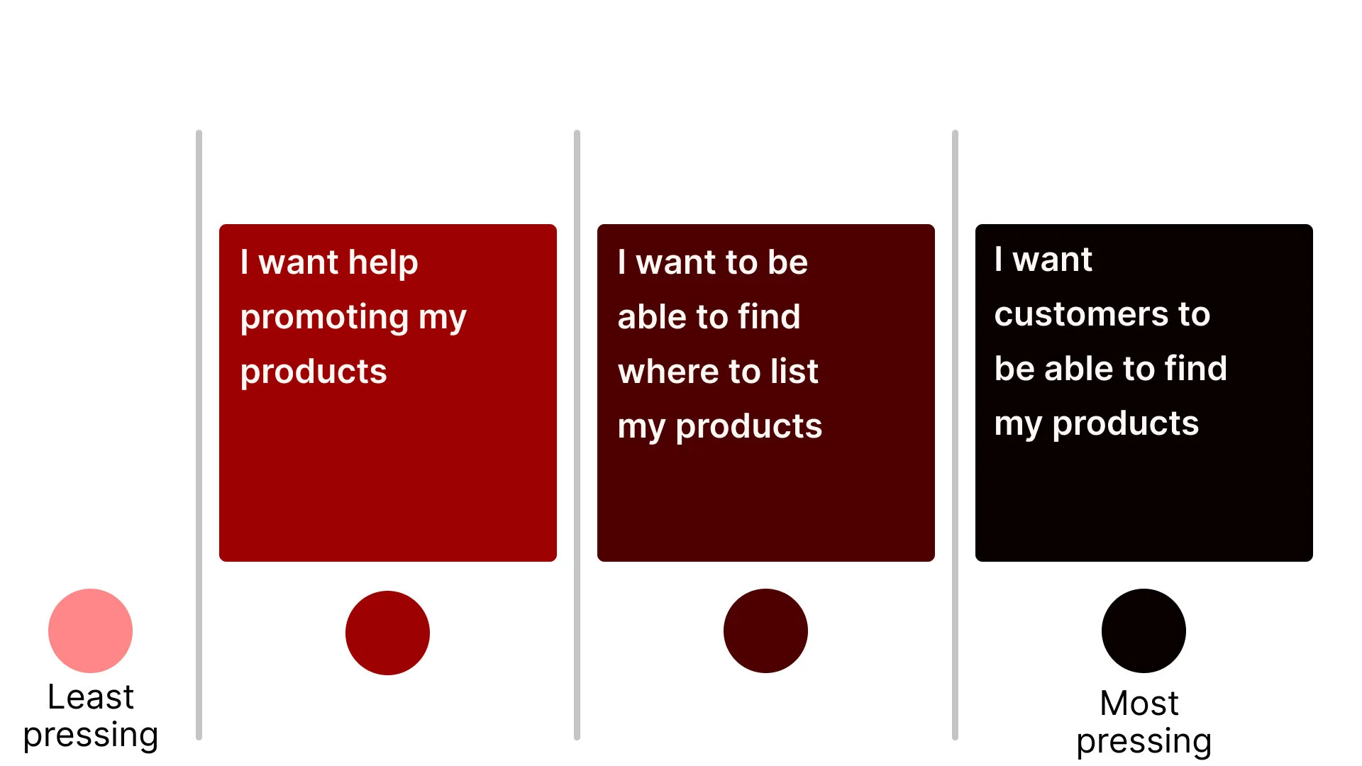
I co-discovered the need…
for internal promotions for bigger reach
to simplify listing process
for customers to be able to find products they want using keywords
Persona
Problem Statement
Aly needs better seller support so that her store will grow organically
How Might We
Design a convenient listing experience
User Flow
I co-created the following user flow.
User is a seller
Happy path of listing an item for sale in their shop on Etsy
User can also view the stats of their shop (e.g., items sold, revenue, etc)
DESIGN
Sketches
Our main goal was to simplify the listing process for sellers
Each member of our group sketched a wire flow and we voted which best solved our users’ pain points
These are the ideas we moved forward with
I created the left three sketched. My team member created the right two. All three of us voted on the sketches
Mood Board
I created a Mood board to get us inspired before moving into the Design System
My goal was to complement the existing branding, like the Etsy Orange, with a color scheme that was inspired by sunrises and nature to mirror the relationship between buyer and seller
Design System
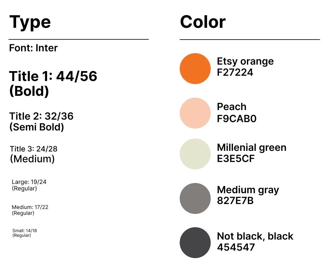
I was inspired by Airbnb to select Inter as our font
Through user testing, I found the color palette to be too broad
So, I reduced the contrast between the colors to add more subtlety
Accessibility
I also worked with an accessibility tool to ensure that there was still enough contrast between colors according to Web Content Accessibility Guidelines (WCAG)
It was important to me that our designs were legible and easy to read by our users
Low-Fidelity Wireframes
High-Fidelity Wireframes
The whole team worked on bringing the wireframes up to high-fidelity
Usability Testing
The whole team worked on the usability testing and iterations
Solution
Feedback
simplify the listing process
realign the fields and categorize them through information architecture
increase font size and decrease color contrast
tedious listing process
arbitrary placement of fields
font too small and colors have too much contrast
Achievements
80% of users were able to list an item for sale through our prototype
100% of users opted to display both a photo and video of the item they were listing for sale
80% of users opted to view the listing as a customer
80% of users opted for Marketing services
Iterations
After Iterations
Our old version
simplification of the listing process
After Iterations
Our old version
use of colors to focus user’s attention on items they expressed were most important to them
After Iterations
Our old version
reducing contrast of colors to create a less distracting color scheme
Prototype
The whole team worked on the prototype
CONCLUSION
Next Steps
Recruit more Etsy sellers for Usability Testing
I want to improve package tracking so customers get more updates on the location of their packages
I want to work with Developers to build out the app
Learning Moments
Just because I sell on Etsy, does not make me the user
Daily stand-ups to foster group dynamics within the team
I loved getting to know one another professionally and building genuine friendships within the team


