Winosaurus
Client Project
Helping data professionals organize wine data to foster business growth
OVERVIEW
Role: UX/UI Designer & Project Manager
Tools: Figma, Photoshop, Illustrator
Duration: 2 months
Team Members: 2 Lead Visual Designers, 1 Lead Researcher
Devices: Web App
Client: Winosaurus
SUMMARY
Redesigned a software that helps Data Scientists organize wine data to foster business growth
Managed a team of four by organizing a three-week design sprint that focuses heavily on fostering team dynamics to ensure a happy and productive work environment
Collaborated with the client to ensure both user needs and business goals are met
RESEARCH
Executive Summary
There is a gap in the Wine Industry
Using Data Analytics in the wine industry to measure sales and predict outcomes has the potential to boost wine sales by 208% (VonVino)
But many wineries don’t gather and analyze data on purchase patterns for wines that they’re selling.
Much of the reason is that they don’t have the tools or software to do so
Winosaurus is a software that helps data professionals organize wine data to foster business growth
Competitive Analysis
Enolytics and Winepulse are the biggest direct competitors to Winosaurus
Most competitors have community spaces which provides users another avenue to search for help when needed
After looking at these competitors, our team was able to identify key features used in analytics interfaces and apply them in our own designs
Affinity Map
I co-discovered the need…
for increased customization options
for UI that was more legible and accessible
for customers to be able to explore their data and reveal actionable insights that might affect business strategy
Persona
Problem Statement
Data Analysts need a way to assess data in order to gain actionable business insights.
How Might We
How might we provide analysts with the functions and UI to swiftly identify business insights?
User Flow
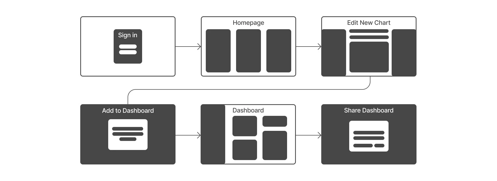
I co-created the following user flow.
User is a data analyst
Happy path: creating a chart, add to dashboard and share with colleagues
We shortened this flow over several iterations because Data Analysts are busy people.
So, the less energy they spend trying to figure out the software means the more energy they can spend analyzing data and sharing it with their colleagues to help meet business goals
DESIGN
Sketches
For the homepage, we decided to remove the “Databases” tab. Users found it unconventional and confusing.
For the chart control panel: In later iterations, we added a time filter. Several Data Analysts expressed how important filtering out time was when analyzing data.
Design System
Thinking about the long hours that a data analyst might have to look at this software, we decided to pick colors based on accessibility to all.
We also wanted to stay within the Winosaurus range of colors and branding.
Accessibility
We explored various color schemes, of course including the brand of Winosaurus.
But at the end of it all, we ended up iterating the original colors to a darker contrast after testing them for accessibility.
Low-Fidelity Wireframes
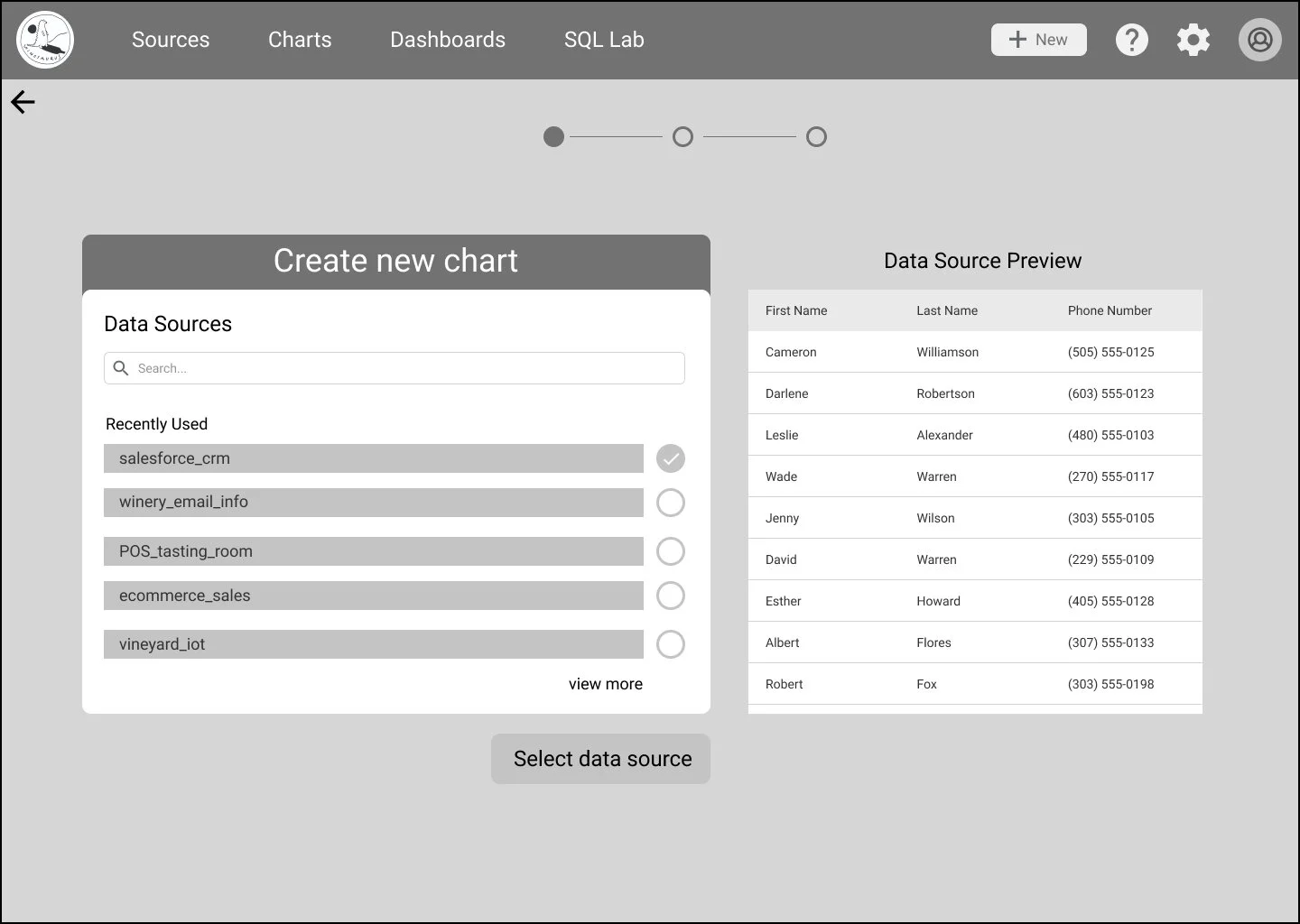
Here you can see our original sign-in and landing pages.
This landing page was largely based upon the existing Winosaurus app and represents the bottom-to-top hierarchy of the product, where data informs charts, which makes up dashboards
We initially had a 2-step dialogue sequence that asked the user to specify a data source and a data visualization before accessing chart-editing features.
We also built out an export process that allowed users to edit settings before downloading the dashboard file.
But of course, we had to test out our decisions.
Low-Fidelity Test Results & Iteration
Results:
1. Too many steps to create a chart
2. Difficult to navigate
Mid-Fidelity Wireframes
We re-arranged the order of the landing page elements because access to dashboards needed to be easier since they users expressed that they are the most-viewed screens in this type of app.
We added more features during the creation of charts and visualizations.
Additionally, we started putting together an “edit-dashboard” page.
Here, users were expected to drag the charts they had just created from the “insert charts” panel onto the dashboard area.
Mid-Fidelity Test Results & Iteration
Results:
1. Adding a time filter to chart control panel
2. Distracting data source tab on homepage
3. Sharing dashboards via URL
High-Fidelity Wireframes
We decided to swap out the stock image of wine bottles because users found it a little distracting.
We replaced the image with Winosaurus illustrations to keep in line with client branding and to add a little fun to the experience.
The team also removed the colorful tabs from the homepage because users were having difficulty deciphering what to focus their attention on.
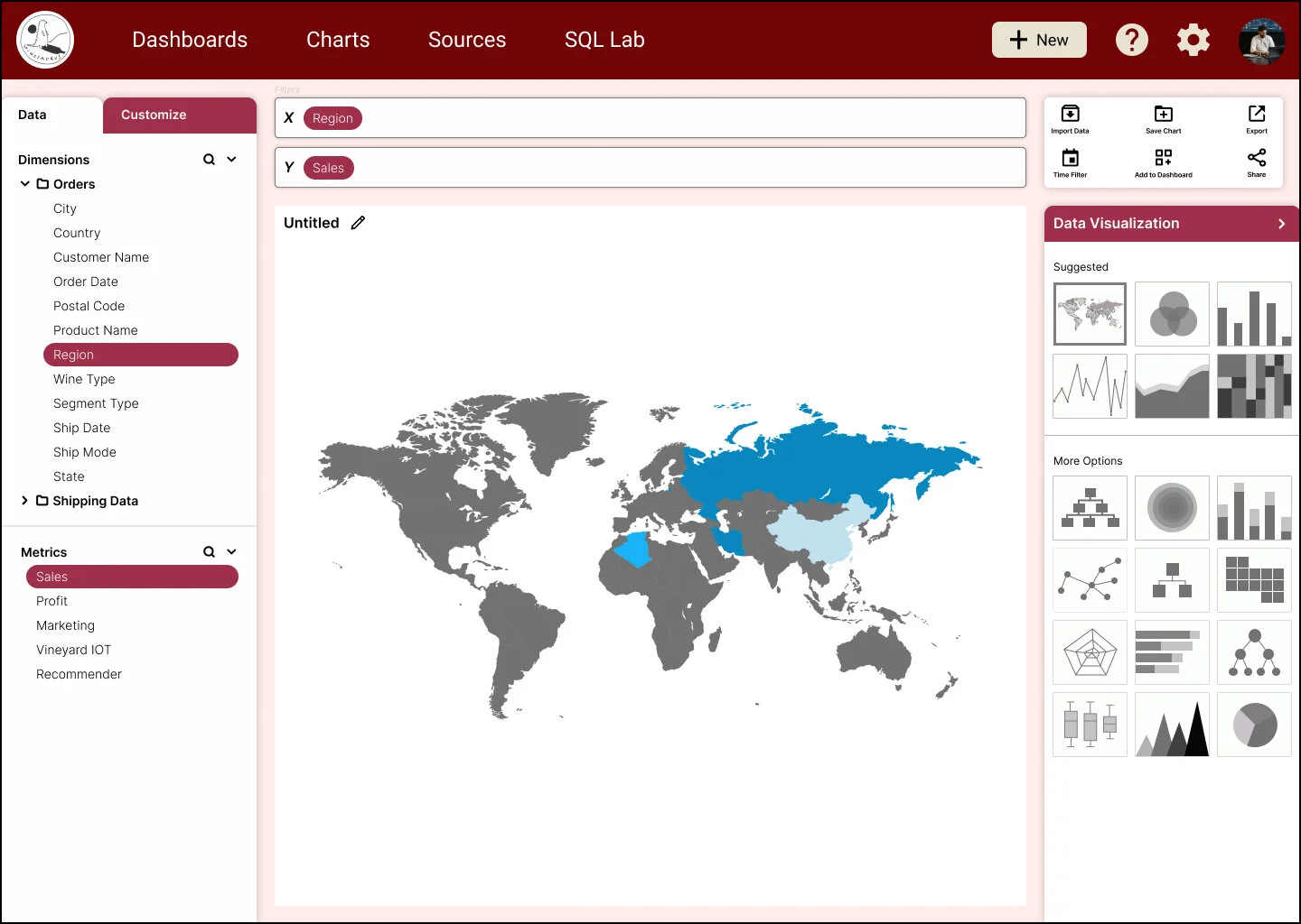
We added suggested data visualizations to the right editing panel to help users complete a new chart faster since Data Analysts are frequently on a time crunch.
Users expressed a desire to customize the layout of their dashboard so we gave them these capabilities
Data Analysts are busy people so we wanted to shorten the steps they have to go through to share their findings with their co-workers/clients.
Prototype
CONCLUSION
Next Steps
User customization
Natural language querying on dashboard
Onboarding tutorial & documentation
Working with Development to bring the web app to life


