
Etsy
Redesigned
OVERVIEW
Role: Lead Visual Designer
Tools: Figma, Photoshop, Illustrator
Duration: 1.5 weeks
Team Members: Reyneal Vargas (Project Manager) and Jimmy Liu (Lead Content Strategist)
Devices: Mobile App
SUMMARY
(SUMMARY HERE)
DEFINE
Executive Summary
According to Veeqo, 82% of Etsy sellers want to grow their businesses
However, only 43% of sellers use the Etsy app to manage their sales
The Etsy Seller App lacks the necessary Seller Support and SEO functions needed to grow their businesses
In addition, the process and pathway of listing a product on the app is long and taxing
Therefore, the app is in need of a revision.

Competitive Analysis
Only Etsy and Amazon offer in platform or internal ads
Despite Etsy being the cheapest in terms of both listing products and marketing, the users still found it challenging to make use of this service
The team was inspired to look into the Seller Support and SEO services that Amazon is currently implementing
DISCOVER

Affinity Map
Need for internal promotions for bigger reach
Need for a less taxing listing process
Need for customers to be able to find the products they want using the right key words
Personas, Problem Statement and How Might We

Problem Statement
Aly needs better seller support so that her store will grow organically
How Might We
Design a convenient listing experience
User Flow

DESIGN

Sketches
Our main goal was to simplify the listing process for sellers
Each member of our group sketched a wire flow
We then presented our ideas
Finally, we voted which ideas best solved our users’ pain points
These are the ideas we decided to move forward with

Mood Board
We created a Mood board to get us inspired before moving into the Design System
Our goal was to complement the existing branding, like the Etsy Orange, with an updated color scheme that would assist users like Aly and Bianca in their goals
Our initial concept was a color scheme inspired by sunrises and nature
We chose this thinking - that during a sunrise - there is a collaboration of nature between the sun and the landscape
We wanted to mirror the relationship we were working on strengthening between the buyer and seller
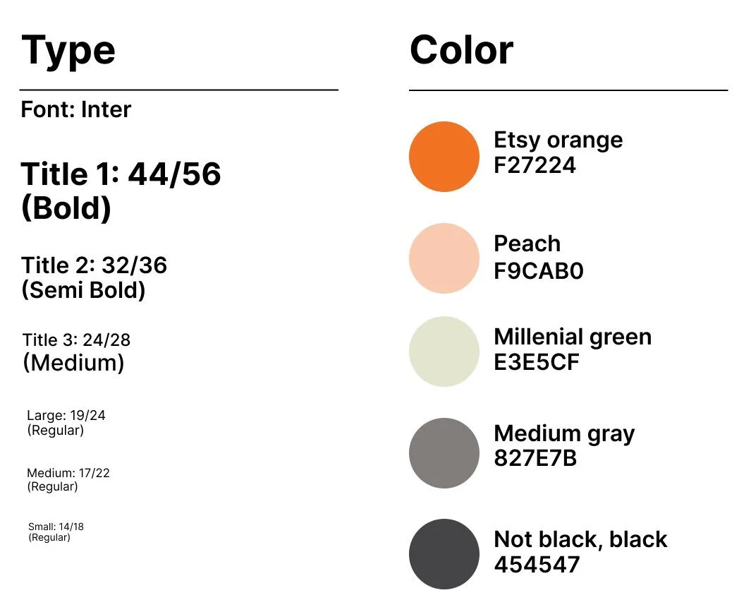
Design System
However, the contrast proved to be too jarring for the users. We also ran into issues with legibility.
Users were spending too long trying to read small fonts and being distracted by punchy backgrounds
Therefore, We reduced the contrast between the colors.
The team realized how powerful the existing Etsy orange was and we decided to still represent colors in nature and sunrises, but with a more subtle tone.
We also increased the font size to account for accessibility because starting a business is hard enough. The last thing sellers need is to be distracted by the app’s design system and refrain from listing their artwork at all.
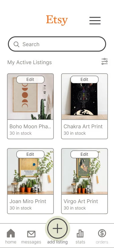
DELIVER
Low-Fidelity Wireframes


Usability Testing
Results
arduous and taxing listing process
the need to simplify the process
arbitrary placement of fields and categories
the need to realign the fields and categorize them through information architecture
Iterations
Old New


Old New
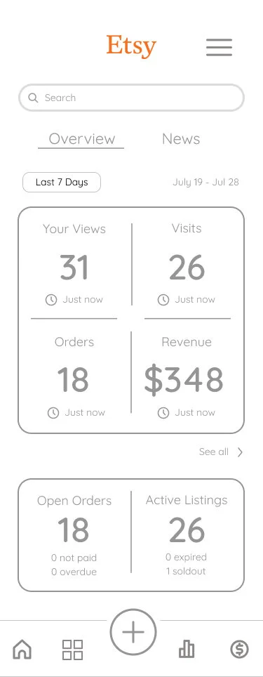

Old New


Clickable Prototype

Make it stand out.
It all begins with an idea. Maybe you want to launch a business. Maybe you want to turn a hobby into something more. Or maybe you have a creative project to share with the world. Whatever it is, the way you tell your story online can make all the difference.

Make it stand out.
It all begins with an idea. Maybe you want to launch a business. Maybe you want to turn a hobby into something more. Or maybe you have a creative project to share with the world. Whatever it is, the way you tell your story online can make all the difference.
“It all begins with an idea. Maybe you want to launch a business. Maybe you want to turn a hobby into something more. Or maybe you have a creative project to share with the world. Whatever it is, the way you tell your story online can make all the difference.”
— Squarespace